
Watercolor Brush Techniques and Washes – Part 2

By Cards

Hi all,

I’m by no means advanced in the realm of watercolor, but I thought it would be a great place to start and give myself a bit of a challenge.

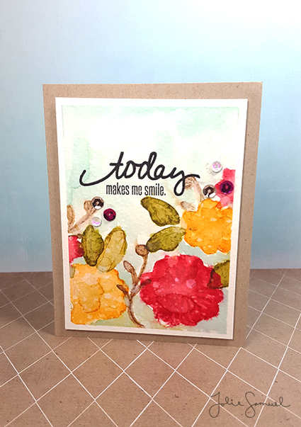
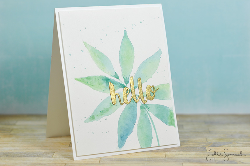
Today’s lesson was JAM PACKED with more ideas on brush techniques and washes. I wanted to try my hands at some leaves and the wet-to-wet technique. I wet the paper in a leaf shape and then used wet pigment to drop in the color. Here I used Prussian Blue and Yellow Green from my Sakura Koi set. I used variations of the colors to achieve different leaves each time around.
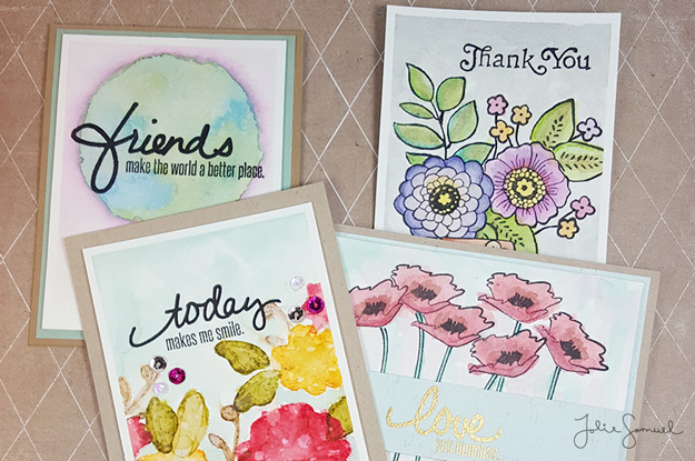
This was my result.

Leaves

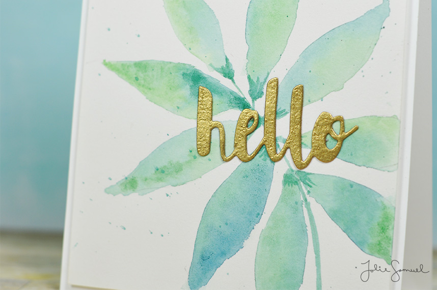
Here’s a closer look at all the variations of color. Again, I’m pretty much a beginner with watercolors and just playing with the medium. I’m hoping to incorporate more washes and techniques into future cardmaking.

Hello-Leaves-2

Hope this quick post inspires you to try something a little new today! Have a fantastic week friends!

Watercolors for Intermediate Level Learners

By Cards

PreClassSwatches

Hi all,

This week I am participating in another online card class and decided to share a few of the projects I’m working on. Prior to class starting it was suggested that participants create swatches of owned watercolors to get a feel for the type of opacity they may have. I have multiple mediums I use when it comes to watercolors on my cards but for this class, I’m sticking with mostly my Sakura Koi set and my Holbein Artists’ Gouache set.I created the swatch sheet to mark down which pigments I found to be opaque (o), semi-translucent (st), or translucent (t).

I created the swatch sheet to mark down which pigments I found to be opaque (o), semi-translucent (st), or translucent (t).


Next, I created the suggested glazing chart as well. The chart uses 3 pigments (red, blue, and  yellow) to create multiple colors and hues. It’s an excellent exercise in learning the types of colors that you can mix together rather than purchase “premade” as a pigment.

PreclassGlazingChart

With the pre-class suggested exercises complete – I’m ready to dig into the course and learn more about watercolors for cardmakers.

Exploring Watercolor Mediums

By Cards

onlinecardclass4

Hi all,

I’m back with multiple cards to share with you all in one day! Surprise!

When it comes to watercolor, there are just a ton of ideas and techniques out there in the world. It can absolutely be overwhelming, but that only inspires me to explore mediums and try out different techniques. I used different mediums for each card and strathmore coldpress watercolor paper for each painting.

For the first card, I used distress markers. I decided to use my Tim Holtz distress markers to create a globe and then added in a highlight around to create that ‘glow’ type feel. Such a pretty card, and it’s as simple as a hand drawn circle and loose watercoloring. The sentiment is a set from Hampton Arts and Jillybean. Love the scripty font!

onlinecardclass3

On the second card, I used a more traditional medium. In my opinion, traditional mediums are more like pan sets, tubes, and inks with high pigmentation. For this I used my distress ink pads. These are different from the markers in that they are more concentrated colors and put out a lot more ink than the markers would. I embraced the concept of free-flowing ink by saturating the paper with quite a bit of water. I absolutely loved the way his one turned out! I can’t believe how uniform the images look together, but individually I just let each shape do it’s own thing.

onlinecardclass2

On this last card I used watercolor pencils. I tried multiple stamped images with this technique (as you’ll see in the first photo). To get the look of free flowing ink I colored slightly outside the lines. Typically, I’m one that always likes to keep cards neat and tidy. This type of quick coloring is totally out of my comfort zone! But there is beauty in going outside those barriers isn’t there? How inspiring!

onlinecardclass1

So this wraps up what’s going on in the craft room and I hope you enjoyed taking a quick look at my projects and practice pieces. I’ll talk with you all real soon. In the meantime feel free to come follow me over on instagram (jolie_samuel) where I post even  more daily happenings of the craftroom and life.

Have a great weekend!

Washi Tape Craftroom Storage Idea

By Craftroom Storage, Room Decor

Hi Friends!

As I’ve mentioned in previous posts, I recently changed up my entire office space. I gave it a fresh coat of paint, some new fabrics and drapes & changed out containers to better suite the space. Throughout the process, I’ve been trying to find unique pieces to create storage. I’m a huge fan of thrift store finds and was on the lookout for some pieces for my space or future projects!

I found two items on 2 different occasions.

First, I found an old ornate looking shelf. \\click here to read that post\\

ComboShot

A few months later, I found a box that looked alot like a letter type box or a configuration box. I’m not entirely sure what its intended purpose was.

ThriftStore_WashiTape

I designed a Christmas configuration box a while ago and thought maybe this piece could function in a similar way. \\Click here to view the configuration box I made for Christmas.\\

As I was reorganizing this week, I figured it was time to get this piece painted. I grabbed a can of my all time favorite spray paint by American Accents and gave the piece a couple coats of spray paint. Immediately I thought of a FANTASTIC purpose for the piece. “I wonder if this would fit a roll of tape,” I thought.

WashiTape-Finished5

Guess what? It totally does! These tapes used to take up 3 jars in my space. How crazy is that?!

WashiTape-Finished6

Oh, my crafty heart!

Both-Units

I decided to pair the piece up with my other shelf.

I can’t believe how fantastic these two pieces turned out! Seriously friends, if you haven’t checked out your local thrift store for some awesome storage finds…you should! Keep in mind that a fresh coat of paint can change an entire piece!

~Happy hunting!